A New Look for Crooli
A dark, quieter site set in our own typeface, artwork made of dots for every story, a newsroom you can scan, and a few places worth exploring. Here is what changed and why.
 Crooli NewsroomCompany news and product updates
Crooli has grown into a company with a digital studio, a family of products, and a lot of experiments in between. The site needed to feel like the place all of that comes from, so we rebuilt it from the ground up.
The aim was a site that is calm to read, quick to find your way around, and clearly ours. Nothing behind it has changed: accounts, forms, the newsroom and every product link work exactly as before.
Dark first, and almost colourless
The site now opens dark: a near-black page, white type, and hairline edges where you might expect boxes. There is one accent, a clear blue, kept for the moments that matter: focus, links and state. Everything else is black, white and the greys in between, so the products and the artwork carry the colour.
If you prefer it light, the toggle in the header switches to a clean white mirror of the same design, and the site remembers your choice.
*This part of the story is interactive. See it on crooli.com.*
Every word is set in [Crooli Sans](/font), our own open-source typeface. Headlines use heavier weights with tight spacing, and everything else sits at a regular weight built for reading on screens. One typeface doing every job. [Here is how we made it](/news/introducing-crooli-sans).
The mark, and a header that gets out of the way
The Crooli mark, two arcs round a dot, sits in the header and draws itself in when a page loads. On the home page it is large and lit from behind, and a click turns its light on.
*This part of the story is interactive. See it on crooli.com.*
As you scroll, the header shrinks into a small floating bar that shows where you are on the page. Its glass does not just blur what passes behind it: it stretches and bends it, with a little grain, like light through old film.
Every story is drawn in dots
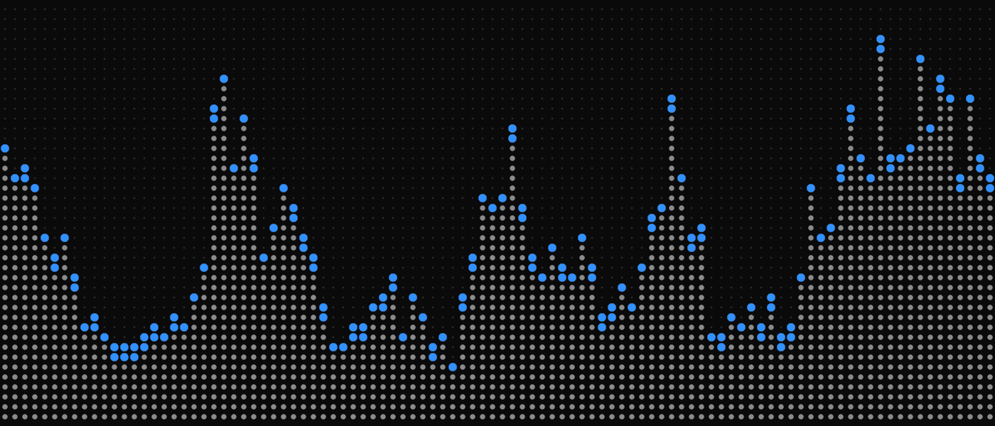
Every post opens with a piece of artwork generated from its own headline, drawn as a panel of tiny lights. The pattern follows the subject: ripples for AI and search, drifting contours like a slowly moving map for company news, rising bars for comparisons. The same headline always makes the same piece, so a story keeps its artwork for good.
Some posts also carry a motif in the middle. A product's own icon appears in dots, in its own colours. A security post gets a padlock, and a comparison splits the panel in two with a seam down the middle. Company news like this post keeps the pattern on its own.
The artwork is alive. Point at it and the dots swell under the pointer. Click it and a shockwave runs through the panel, throws the dots out, and lets them settle into the next version of the piece.
Try it with a headline of your own:
*This part of the story is interactive. See it on crooli.com.*
A newsroom you can scan
The [newsroom](/news) now reads like one. The newest stories lead with their artwork, the latest sit in a grid, and everything older is a plain list by month. Topics filter it all in place. Hover over a story to see its summary, and watch its artwork come to life.
Posts themselves are simpler to read: the headline and summary first, then the artwork, then the story in a single comfortable column, with related stories at the end.
Posts can also include live pieces in the middle of the text, like the colour swatches and artwork playground above. Here is one more, built from the newsroom itself. It counts every post we have published, month by month. Hover over a month to see what went out.
*This part of the story is interactive. See it on crooli.com.*
What it costs to download
A richer site has a price, and we would rather show it than hide it. The stylesheet every page loads grew by about a quarter in this redesign, mostly from the newsroom, the artwork and the new pages. Sent to your browser, it is 34 KB, about a third the size of a single story's artwork.
!The site's stylesheet, before and after
A few places worth a visit
Some pages are there to be explored.
- [The future of Crooli](/future) is one long scroll over a field of dots. Uncover the headline with your pointer, watch the dots become the mark, then a voice, then an orb you can talk to.
- The home page now lists the parts of Crooli as an index. Point at one to see its artwork.
- If you follow a broken link, the page you land on falls apart. Click to put it back together.
What is next
The new design is live across every page today, from the newsroom to legal. The studio, TIZZLE, keeps its own home at tizzle.org, and the Collective and Labs pages present every product in one consistent way.
If something looks off, or you have ideas for what the newsroom should show next, [get in touch](/contact). We read everything.